Modernizing Tradition: How Whole Foods Streamlined Branding for a Sophisticated Retail Experience
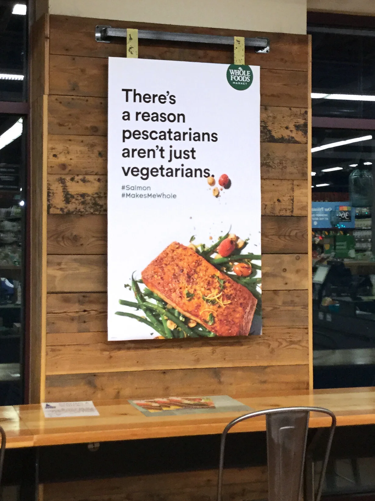
Through the Whole Foods Market rebrand, I learned how a strategic shift in brand systems can modernize a retail space while streamlining production processes. While the logo was updated, the more significant transformation came from the transition away from hand-drawn signage to larger print and digital assets, introducing a cleaner, more sophisticated aesthetic. This shift reduced production time, simplified campaign execution, and brought a contemporary, minimalist feel to stores that were beginning to feel aged. By isolating design elements—focusing on simple photography, large typography, and an understated logo—the brand moved toward an "anti-brand" aesthetic often associated with luxury, elevating the grocery shopping experience while maintaining its core value, good food.


Whole Foods Market is a mission-driven grocery retailer dedicated to nourishing people and the planet. Renowned for its commitment to high-quality, natural, and organic products, Whole Foods Market fosters a vibrant community where health, sustainability, and ethical sourcing thrive.
In my role at Whole Foods Market, I contributed to enhancing the store’s visual presence and supporting sales initiatives through effective design solutions. Key accomplishments include:
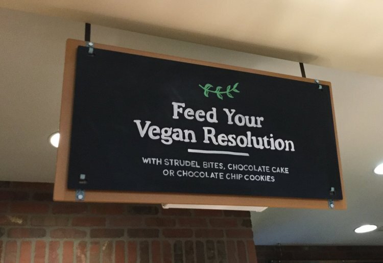
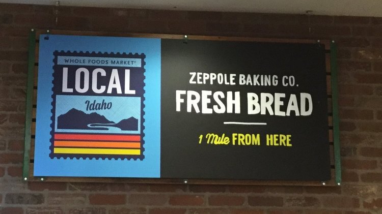
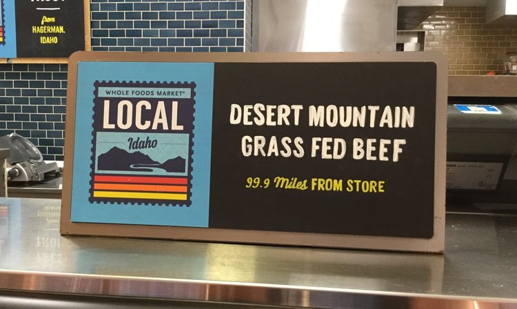
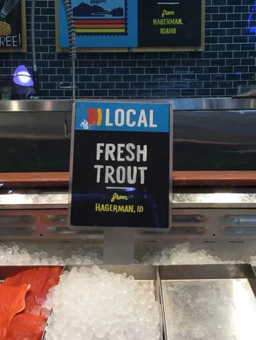
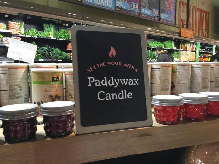
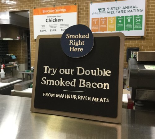
Developed in-store signage and marketing materials that aligned with regional marketing strategies while addressing local store priorities, driving customer engagement and reinforcing brand consistency.
Collaborated with regional marketing direction to create visually appealing promotional content, including product displays and event signage, that boosted in-store traffic and sales.
Adapted corporate branding to meet store-specific needs, balancing strategic objectives with local community connections to create a welcoming and engaging shopping experience.